

From Casual Viewers to Classrooms:
Designing zoolife's Educator Experience
As the sole product designer at zoolife, reporting directly to the CEO, I led the design of the platform's educator experience — taking a consumer animal live-streaming product and shaping it into something teachers could actually use in a classroom.

In A Nutshell
We expanded zoolife into a new product category — education — by designing the experience around the one thing teachers buy on: saved prep time. The launch validated the bet, and educator is now a core part of the product roadmap.
Overview
As integrated lead designer at zoolife (via data loft), I had a direct line into UX strategy and product vision, which I worked on directly with the founder and CEO.
From August 2025 (first launch) to June 2026 (second launch)
-
Expand into education and reach teachers using live animals in the classroom: a fundamentally different audience showing up for a completely different reason than zoolife’s core audience, “animal lovers” and zoo fans.
-
I owned design end to end, working directly with Anna Hu, CEO on direction and prioritization and our developers on what was feasible to build.
-
Figma, Mixpanel, HotJar, Dovetail, Mailmodo (reaching out to educators in our lists), Various AI tools (Claude, Gemini and Tactiq helped me in maintaining a UXR stream alongside a marketing stream to support the work)
Getting Started
I'd already been the designer across zoolife's product and growth work, so I knew the brand and the consumer side well. The educator push was different. I couldn't design my way to it from the existing screens, because the problem wasn't visual — it was that we didn't yet know what teachers actually needed from us.
A consumer browses to enjoy. A teacher arrives with a specific class to fill, limited prep time, and a need to trust that what they pick is age-appropriate and ready to use.
Research & Discovery
I structured the research around April Dunford's positioning framework. The question we wanted to answer was less "do teachers like animals" (they do) and more "what job is a teacher hiring this to do, and against what alternatives."
Teacher interviews. I ran interviews and surveys focused on how teachers plan, what they already reach for, and where a live-animal platform could earn a place in a lesson rather than compete with one.
An advisory program, not a one-off study. To keep validation continuous, I built an educator advisory program instead of running research once and moving on: multi-wave outreach across cold and warm segments, incentivized participation, all structured into a research repository so insight compounded between rounds instead of evaporating. I treated U.S. findings as market-specific rather than assuming they generalized.
Holding the full stack meant I could triangulate rather than guess: interviews for the why, data analysis for how teachers actually moved through the product, and keeping an eye on our key KPIs for what they did at scale. (Adoption rates, Educator Plan check-outs, etc.)
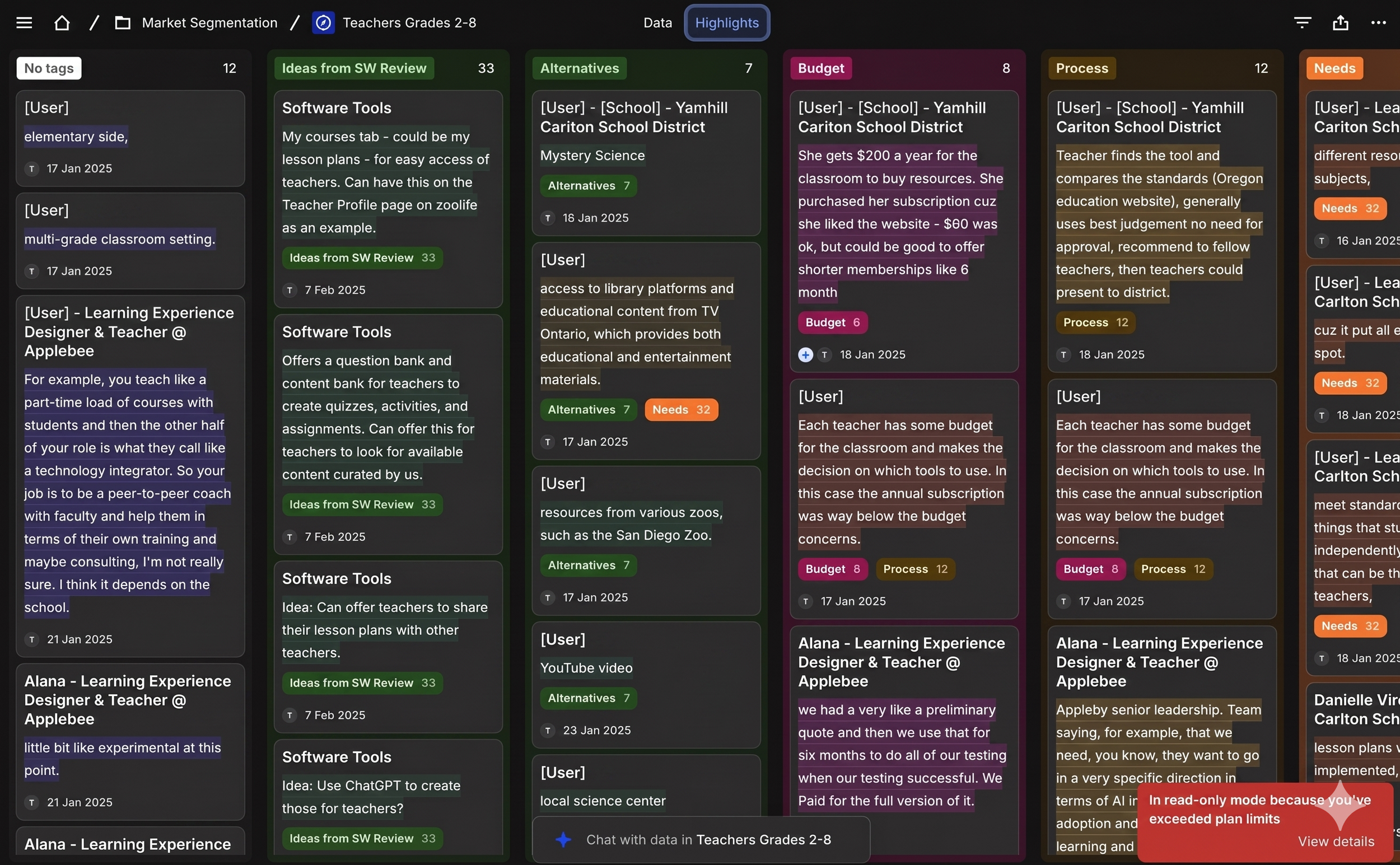


The Insight
The strongest signal wasn't richer animal content. It was prep time. Teachers adopt what saves them prep time — and the form factor that mapped to that was curriculum packs: ready-to-use, drop-into-a-class resources in the mold teachers already trust from marketplaces like TPT.
That reframed the whole direction. The question stopped being "how do we make the cams more educational" and became "how do we give a teacher something usable in five minutes." Every design decision downstream followed from that.
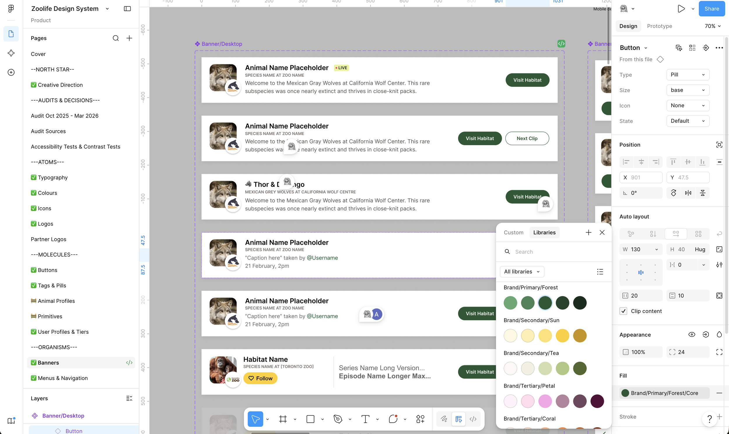
The Design System
Figma SystemThe Design Process
The core moves, all built around the prep-time insight:
Separated the educator path from the consumer flow at entry and onboarding, so teachers weren't reverse-engineering a product built for someone else.
Restructured discovery around classroom intent — grade, subject, use — instead of animal taxonomy, matching how a teacher actually searches.
Designed the free and gated states so a teacher could see the value before hitting a wall, rather than running into a product that felt broken.
Built it on the design system so the whole educator surface stayed coherent and scalable as it grew.
Before diving deeper past our proof of concept, there was a problem underneath the problem: the brand direction wasn't settled enough to build on, and there was no design system or UI library to speak of. Each feature had been either designed from scratch, or stood up by engineers using various libraries. Codifying tokens against a moving target would have meant rework with every shift. So I helped the CEO hone in on the brand north star first, then translated it into a system: a two-layer Figma variable setup with primitives feeding a semantic layer, named to align with shadcn/Tailwind front end. I worked with Adi, the lead engineer, to land on a strategy that would make both our processes easier. This codified patterns we could adopt quickly enable educator features to feel on brand and consistent with the rest of the product as well as fast to spin up.
zoolife for educators, 2026
The prep-time bet held up against real usage. Teachers entered through a path built for them and found resources by classroom intent — and it earned enough validation to keep investing in, and opened up new user journeys for us to design.
It's now in a third round of redesign, driven by how teachers are actually using it.